

Mastering ems charting methods for Faster, More Accurate Documentation
Solid EMS charting methods are the bedrock of prehospital care today. We've come a long way from scribbled, handwritten notes to smart electronic systems that genuinely improve patient outcomes and make our agencies run smoother. This isn't just about checking boxes; it’s a core part of communication, legal defense, and quality control.
Why Modern Charting Is More Than Just Paperwork
In EMS, the quality of your documentation is just as critical as the quality of your clinical care. Seriously. Think of a patient chart less like a chore and more like the official story of that encounter. It's the bridge between what happened in the field and what the hospital team needs to know, ensuring care continues without a hitch. The old paper forms? They were a mess—illegible handwriting, missing information, and not enough space, creating huge risks for everyone involved.
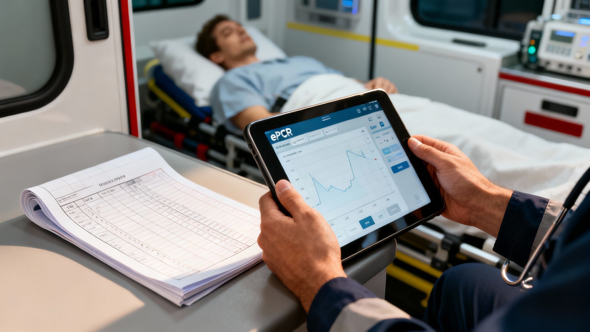
That's where electronic Patient Care Reports (ePCRs) changed the game. They give us a structured, clear way to capture every single detail from a call. This isn't just about trading a pen for a tablet; it's a fundamental upgrade to how we deliver and measure care.
From Tedious Task to Strategic Tool
Believe it or not, good charting directly impacts an agency's budget. A well-written report that clearly shows medical necessity is the key to getting paid and avoiding claim denials. It's one of the easiest ways to maximize revenue without adding a single truck to the fleet.
The old saying still holds true: "If it wasn't documented, it wasn't done." Today, that applies just as much to billing and legal protection. Your detailed report is your best shield against liability and your most reliable path to financial health.
Modern charting systems are also data goldmines. When you can analyze trends across thousands of reports, you can start making smart decisions. You can see where protocols need tweaking, justify buying that new piece of gear, or figure out the best place to post a unit for faster response times. This data-driven thinking saves on fuel and maintenance while actually improving patient care in the community. To get there, you have to move past basic typing. Many agencies are now looking into tools like voice recognition software for medical transcription to slash documentation time, freeing up medics to focus on what matters most—the patient.
Comparing Charting Methods
When you put the old way and the new way side-by-side, it's pretty clear why moving to an ePCR system is a no-brainer for any forward-thinking agency. The differences are stark.
Traditional Paper Charting vs Modern ePCR Systems
Let's break down exactly how these two approaches stack up against each other.
| Attribute | Paper-Based Charting | Electronic (ePCR) Charting |
|---|---|---|
| Speed & Efficiency | Slow, manual, and often completed after a shift. | Faster data entry with dropdowns, templates, and real-time input. |
| Accuracy & Legibility | Prone to errors, omissions, and illegible handwriting. | Standardized fields and validation checks reduce errors by over 50%. |
| Data Analysis | Nearly impossible to aggregate and analyze data system-wide. | Enables powerful QA, trend analysis, and operational reporting. |
| Integration | Isolated record; difficult to share with hospitals. | Seamlessly integrates with hospital EMRs and billing systems. |
| Financial Impact | Leads to high rates of denied claims and lost revenue. | Optimizes billing and reimbursement, directly boosting the budget. |
The takeaway is simple: while paper might feel familiar, ePCR systems offer massive advantages in speed, accuracy, data analysis, and financial performance. It's an investment that pays for itself many times over.
Core Charting Frameworks Every Provider Must Know
Think of EMS charting frameworks as different blueprints for telling a patient's story. Each one gives you a solid structure to organize your thoughts and build a coherent narrative, but they all focus on slightly different angles of the call.
Getting the right one for the job streamlines your documentation, makes for a cleaner handoff, and ensures your report is both medically sound and legally bulletproof.

These aren't just about filling out boxes on a screen. They’re proven communication tools that give structure to your clinical thinking when you're under pressure. Mastering them is what separates the task-doers from the true clinical storytellers.
The SOAP Method: Telling the Full Patient Story
The SOAP framework is a classic for a reason—it tells the whole story from start to finish. It walks you through the patient’s side of things, your objective findings, your clinical impression, and finally, what you did about it. This creates a logical flow that the ER staff can pick up and run with.
It's almost like you're a detective building a case:
- S (Subjective): This is the patient’s story, in their own words. Practical example: "My chest feels like an elephant is sitting on it." It’s what they tell you.
- O (Objective): This is what you see, hear, and measure. It’s the hard data—vital signs, EKG findings, and your physical exam. Practical example: BP 160/90, HR 110, SpO2 93%, skin pale/diaphoretic, 12-lead shows ST elevation in leads II, III, aVF. It’s the unbiased evidence.
- A (Assessment): This is your professional impression. You take the subjective and objective clues and form a working diagnosis. Practical example: "Suspected Acute Myocardial Infarction."
- P (Plan): This is exactly what you did. Document every single intervention, from giving O2 and aspirin to your transport decision and destination. Practical example: O2 at 4 LPM via NC, Aspirin 324mg PO, Nitroglycerin 0.4mg SL, established 18g IV in L AC, transmitted 12-lead to hospital and activated STEMI alert.
Actionable Insight: For a chest pain call, a solid SOAP note connects the patient's complaint directly to your clinical actions. That clear link is gold for demonstrating medical necessity—something billing and QA live and die by. A complete SOAP note can be the difference between a paid claim and a denial.
The CHART Method: A Chronological Log of the Call
If SOAP tells the story, the CHART method creates the timeline. It’s a fantastic framework for documenting the call chronologically, making sure no step is missed from the moment you get the chief complaint to when you drop the patient off.
CHART breaks down the call into a simple, sequential log:
- C (Chief Complaint): Why was 911 called? Practical example: "78-year-old male complaining of difficulty breathing."
- H (History): The patient’s relevant medical background, meds, and allergies.
- A (Assessment): Your physical findings and vital signs.
- R (Rx/Treatment): The interventions and treatments you provided on scene and en route. Practical example: Administered nebulized Albuterol/Ipratropium, placed on CPAP at 5 cmH2O.
- T (Transport): All the details about the transport, including any changes in the patient's condition and the receiving facility. Practical example: Transported patient semi-Fowler's, noted improved work of breathing en route to General Hospital.
This linear approach is incredibly useful for trauma calls or any situation where the sequence of events is critical to understanding what happened. To see how these different structures play out in the real world, check out these excellent patient care report examples.
The SAMPLE History: The Patient Investigation Toolkit
While SOAP and CHART give structure to the entire report, the SAMPLE history is a specialized tool you use within those frameworks. It’s your go-to mnemonic for grabbing a patient’s essential background info quickly, especially when the clock is ticking.
Let’s use it on that same chest pain patient:
- S (Signs/Symptoms): What are they actually experiencing? (Practical example: Crushing chest pain, shortness of breath).
- A (Allergies): Allergic to any medications? (Practical example: Penicillin).
- M (Medications): What prescriptions are they taking? (Practical example: Lisinopril, Metformin).
- P (Past Medical History): Any relevant history? (Practical example: Hypertension, previous heart attack).
- L (Last Oral Intake): When did they last eat or drink? (Practical example: "A sandwich about two hours ago." Super important if they might need surgery).
- E (Events Leading Up): What were they doing right before this started? (Practical example: Walking upstairs).
Picking the right framework for the call saves a ton of time and prevents you from leaving dangerous information gaps. For a medical call like chest pain, a SOAP note that weaves in a SAMPLE history is tough to beat. For a multi-vehicle pile-up, the step-by-step flow of CHART might make more sense.
Ultimately, mastering these EMS charting methods does more than just fill a requirement. It tightens up your handoff communication, cuts down on paperwork time, and makes sure every patient's story gets told accurately and completely. That efficiency leads directly to better patient outcomes and a healthier bottom line for your agency.
How Quality Charting Fuels System-Wide Improvement
A well-written patient care report does a hell of a lot more than just close out a single call. It’s a vital piece of the puzzle that, when you put it together with hundreds of others, creates a powerful feedback loop for your entire EMS system. Think of it this way: each chart is a single pixel. On its own, it’s just a dot. But together, those pixels form a crystal-clear, high-res picture of your agency’s performance and your community’s health.
This leap from an individual run report to system-wide intelligence is really the heart of modern Quality Assurance (QA). By digging into aggregated ePCR data, agency leaders can finally move past guesswork. They can make data-driven decisions that save money, improve care, and ultimately, save lives.
From Individual Reports to Actionable Intelligence
Every single field you fill out contributes to the larger story of your operations. This data gives QA coordinators and medical directors the ability to spot trends that would otherwise be completely invisible. Are crews consistently having a tough time with a specific procedure? Are response times dragging in a particular district during certain hours? Your charts hold all the answers.
This collective data becomes the bedrock for real, meaningful change:
- Identifying Training Gaps: If the data shows frequent mistakes in drug dosage calculations or inconsistent use of a new protocol, that’s a flashing red light signaling a need for targeted training. Actionable Insight: Instead of broad, generic refreshers, agencies can build workshops that hit these documented weak spots. That saves money by focusing training budgets precisely where they’re needed most, avoiding costly system-wide retraining.
- Refining Treatment Protocols: Aggregated patient outcomes can tell you if a specific protocol is actually as effective in the field as everyone hoped. This kind of evidence is what you need to make informed updates that improve patient outcomes across the board.
- Justifying Agency Value: When it's budget time and you need to ask for new equipment or more staff, a compelling story backed by hard data is your best friend. Practical example: Showing a city council a chart that proves a new CPR device improved ROSC rates by 15% is a whole lot more persuasive than just saying you need it.
Incomplete or sloppy charting torpedoes these efforts. Gaps in your documentation can hide critical insights, making it nearly impossible to assess performance and make things better. For example, a recent study pointed out major documentation issues in stroke care, where only 24% of crews documented the patient's "last known well" time—a piece of information that’s absolutely critical for treatment decisions. You can read the full research on how charting gaps can hinder effective care to get a sense of the problem.
A Real-World Example of Data in Action
Imagine an agency that noticed a disturbing trend in its cardiac arrest survival rates. After digging through months of ePCR data, the QA team pinpointed the problem: the average time from patient contact to the first defibrillation was way too long. The charts showed crews were often delaying the shock to get other tasks done first.
Armed with this data, the agency rolled out a new "shock-first" protocol for witnessed arrests and ran some focused training sessions. They tracked the data like a hawk for the next six months. The result? The time-to-first-shock plummeted by an average of 90 seconds, and ROSC rates saw a measurable jump. That change, born from a careful analysis of everyday charting, had a direct, life-saving impact.
Every data field you complete is a contribution to a massive, ongoing clinical study. Your detailed documentation of a single cardiac arrest today could provide the insight that saves ten lives next year.
This really connects the daily grind of documentation to a much bigger mission. Precise and complete EMS charting methods aren't just about checking a box for admin; they are a core professional responsibility. Every time you accurately document a vital sign, a medication, or how a patient responded to treatment, you’re strengthening your agency, protecting your community, and shaping the future of prehospital care.
Protecting Your Agency Through Legal and Financial Diligence
In EMS, your Patient Care Report (PCR) is so much more than a quick summary of the call. It’s a legal document. It's the primary, and often only, evidence of the care you provided. From the courtroom to the billing office, one old saying rings true: "If it wasn't documented, it wasn't done."
That single principle has massive implications. A vague or incomplete chart opens up your providers and your entire agency to some serious legal risks. On the flip side, a detailed, accurate report is your best defense and the straightest line to keeping your agency financially healthy.
Charting for Legal Protection
You have to think of your PCR as your sworn testimony, written down as it happened. If a lawsuit or a quality assurance review ever comes up, that document is going under a microscope. Vague phrases like "patient was stable" or "transported without incident" offer absolutely zero legal cover because they lack any real, objective evidence.
Practical example: Instead of "patient was combative," write "Patient attempted to strike crew members with a closed fist three times and required soft restraints for crew and patient safety." Your narrative needs to paint a crystal-clear picture of what you did and how the patient responded. That means documenting every single assessment, intervention, and change in condition with precision. A solid legal defense is built on the specifics—the exact vital signs before and after a med was given, the patient’s own words, and the "why" behind your treatment choices. When you meticulously record those details, you're building a powerful legal shield. It's also critical to ensure this sensitive data is kept safe; you can learn more about comprehensive platform security to protect both patient and agency information.
The Financial Lifeline of Good Documentation
Beyond protecting you legally, detailed charting is what fuels your agency's revenue. Insurance companies and government payers like Medicare look at claims with a fine-toothed comb. They are hunting for one thing above all else: documented medical necessity.
Your report has to spell out exactly why the transport and the treatments were necessary. It's all about connecting your findings to your actions. Practical example: Documenting a patient's SpO2 of 88% on room air is the medical necessity that justifies giving oxygen. Noting a patient is non-ambulatory and requires a stretcher is what justifies the ambulance service itself. Without that clear link, claims get denied—fast.
An estimated 5-10% of all medical claims are denied right off the bat, and it's often because of weak or missing documentation. For an EMS agency, that can add up to hundreds of thousands of dollars in lost revenue every year.
Actionable Insight: Thorough, accurate charting is the single most effective way to ensure your agency gets paid for its services. It cuts down on claim denials and brings in more revenue than hiring expensive billing consultants to chase down payments after the fact. This simple practice directly increases your agency's available funds without any additional capital investment.
Essential Elements for a Billable Report
To get paid and steer clear of those costly denials, every single report needs to include a few non-negotiable elements. Think of this as your pre-flight checklist for getting a claim approved.
- Documented Medical Necessity: State clearly why the patient needed an ambulance. Practical example: "Patient is post-ictal and unable to ambulate safely, requiring stretcher transport."
- Detailed Assessment Findings: Get complete sets of vitals, GCS scores, pain scales, and physical exam findings that back up your clinical impression.
- Specific Interventions: List every treatment, medication dose, and procedure you performed. Then, connect each one back to an assessment finding.
- Accurate Mileage: Document the loaded mileage from the scene to the receiving hospital. It's basic, but it's a critical and often-missed part of reimbursement.
- Proper Signatures: Make sure you get the required patient and provider signatures. This validates the whole encounter and gives you consent to bill.
By making these practices a standard part of your charting, you turn documentation from a chore into a strategic tool. It protects your medics, secures your agency’s finances, and proves the excellent care you deliver on every single call.
Integrating ePCR Systems for Seamless Data Exchange
In modern EMS, a patient care report isn’t just a static document anymore; it's a dynamic piece of data that needs to travel. A standalone electronic Patient Care Report (ePCR) system is like a smartphone with no internet connection—it works, but you're missing out on its most powerful features. Integrating your ePCR with other healthcare systems is what unlocks its real potential, creating a seamless flow of information that cuts down on errors, saves critical time, and ultimately leads to better patient outcomes.
This kind of integration breaks down the walls that have traditionally separated prehospital care from what happens inside the hospital. The key is connecting with Health Information Exchanges (HIEs), which are secure networks that let different healthcare providers share patient information.
Pulling Data for Better Field Decisions
Picture this: you arrive on scene to find an unresponsive patient. Without integration, you're flying blind, starting from scratch. But with an integrated ePCR system plugged into an HIE, you can pull that patient's vital history directly from hospital records right then and there.
Suddenly, you've got a window into crucial information:
- Known Allergies: You can avoid giving a medication that could cause a life-threatening reaction.
- Cardiac History: Practical example: Seeing a note about a recent cardiac cath that shows a 90% LAD blockage completely changes how you approach a chest pain call.
- Recent Hospitalizations: Knowing the patient was just discharged for a pulmonary embolism gives you immediate, critical context for their shortness of breath.
This isn't just a hypothetical. It’s a proven game-changer. A project in Indianapolis that linked EMS with a local HIE found that medics could access patient data on up to 26% of their calls. This immediate access to demographics, lab results, and ED history transforms care, helping crews make smarter transport decisions and avoid redundant tests. You can dive deeper into these tangible benefits by reading the findings on EMS and HIE connectivity.
This diagram really drives home the path from diligent care to good charting and, ultimately, to financial stability for the agency.
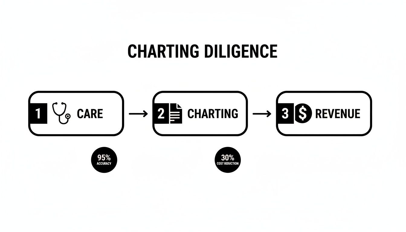
It shows how every step is connected, with quality charting acting as the essential bridge between providing excellent patient care and securing the revenue needed to keep the lights on.
Pushing Data to Prepare the ED
It's not just a one-way street, either. As you're charting en route to the hospital, an integrated system can push that data directly to the receiving facility's electronic medical record (EMR). This gives the emergency department a massive head start.
When the ED gets your full report—vitals, EKG strips, interventions, everything—before you even pull into the ambulance bay, they can get ready. A STEMI alert is activated. The trauma room is staffed. The right specialists are paged. The "handoff delay" all but disappears, getting the patient to definitive care that much faster.
This continuous stream of information follows the patient's entire journey, from the 911 call to their hospital discharge. Agencies looking to build out these capabilities can explore various software features for first responders that are designed to support these kinds of integrations.
Saving Money by Choosing the Right Vendor
Actionable Insight: For agency leaders, one of the biggest opportunities to save money happens right at the beginning, during the procurement process. When you're talking to ePCR vendors, there are two questions that absolutely have to be asked:
- Is your system fully NEMSIS compliant? This is non-negotiable for ensuring your data is standardized and shareable.
- Do you offer built-in HIE connectivity and integrations with hospital EMRs?
Picking a vendor that already has these capabilities can save your agency tens of thousands of dollars in custom development fees later on. It's the difference between buying a system that's ready to communicate out of the box versus one that will need expensive, time-consuming work just to speak the same language as your hospital partners. Investing in an interoperable system from day one is one of the smartest financial moves an agency can make.
Using Data Visualization for Smarter Operations
Every time a crew completes a chart, they’re not just closing out a patient record. They’re adding a small piece to a giant puzzle that tells the story of your community's health and your agency’s performance. When you start putting those pieces together, your data stops being an administrative chore and becomes one of your sharpest tools for making smarter, more cost-effective decisions on the ground.
This is where modern, NEMSIS-compliant ePCR systems really shine. They're built to take all that raw data and turn it into something you can actually use. We’re talking about data visualization—a fancy term for turning spreadsheets and numbers into simple charts, graphs, and maps. Instead of drowning in thousands of individual reports, you can see the big picture at a glance. It's the key to shifting from just reacting to calls to proactively managing your resources with real evidence.
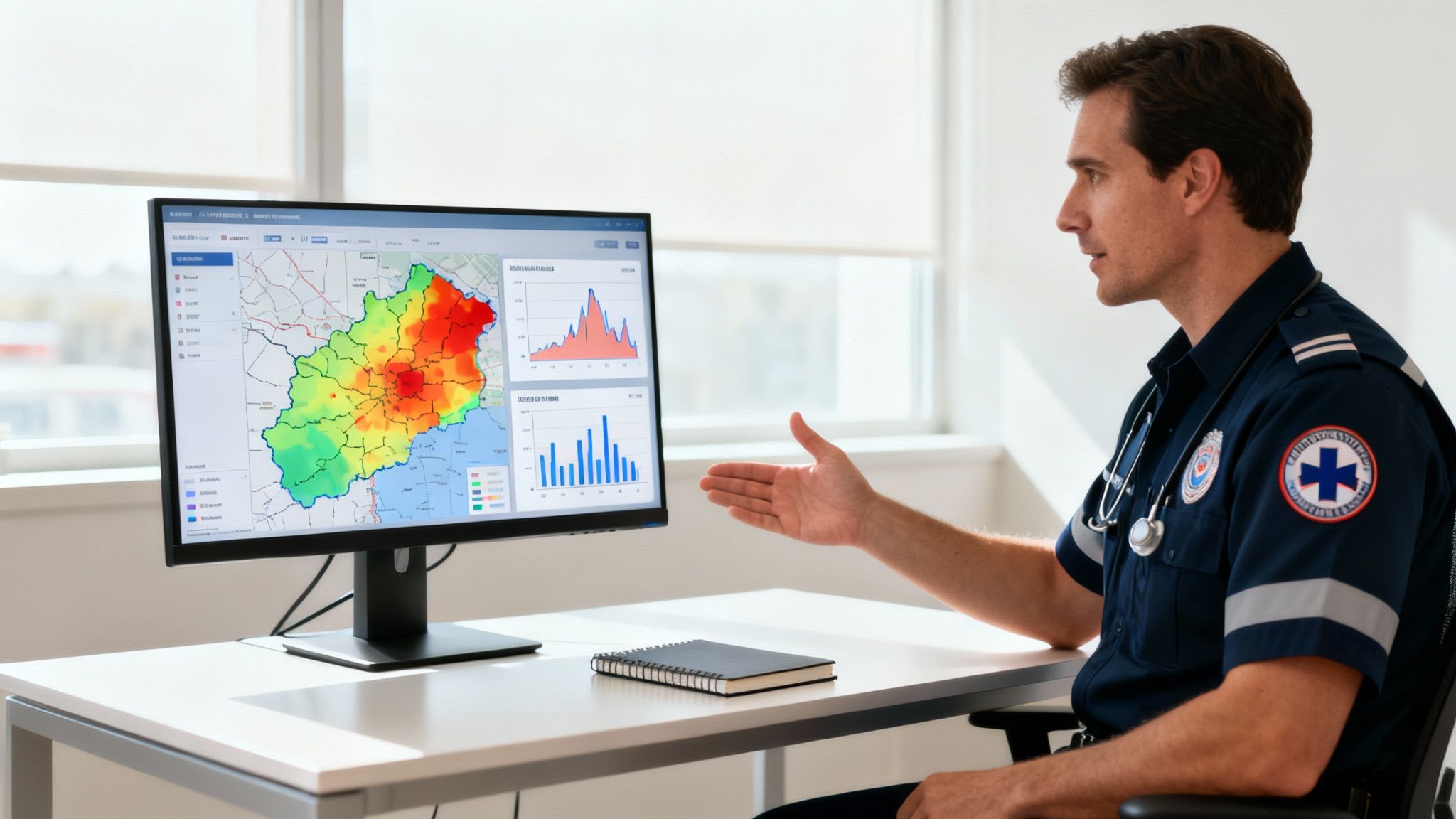
From Raw Data to Actionable Insights
Putting your charting data into a visual format helps you answer critical operational questions fast. Each type of visual gives you a unique angle on what’s happening out there, helping you put the right people and equipment in the right place at the right time. This is why having standardized data is such a game-changer.
The National Emergency Medical Services Information System (NEMSIS) created a uniform dataset that thousands of agencies across the country contribute to. This allows analytical models to chew on that data and spit out visualizations that rank emergencies by district, time of day, or call type. It’s what makes forecasting possible for over 20 million US EMS events every year. You can dive deeper into how NEMSIS data shapes emergency response on arxiv.org.
Here’s how this plays out in the real world:
- Heat Maps: By plotting call locations, you can instantly see your hotspots. Practical example: A heat map reveals a cluster of falls in a specific retirement community, or that a particular intersection is a magnet for MVCs after 10 PM on weekends.
- Pie Charts and Bar Graphs: These are perfect for breaking down your call types. A quick glance might show that 30% of your calls are for respiratory distress, which tells you it might be time for some focused training or new equipment.
- Timelines and Trend Lines: Plotting call volume by the hour or day of the week shows you the predictable ebbs and flows in demand. This is gold for optimizing shift schedules.
Turning Visualizations into Bottom-Line Savings
The real power here is making decisions that save money without ever compromising patient care. When you know where and when your services are needed most, you can stop guessing and start building a real strategy.
Visualized charting data allows an agency to deploy its most expensive assets—its people and its vehicles—with surgical precision. This proactive stance on resource management is one of the most effective cost-containment strategies available.
This approach leads to some very real savings:
- Strategic Unit Positioning: Actionable Insight: Instead of returning to a station after every call, use heat map data to stage an ambulance in a known hotspot during peak hours. This doesn't just cut response times; it saves a significant amount on fuel and reduces the wear-and-tear that comes from flying across town from a distant station.
- Optimized Staffing: If your data shows a consistent lull in calls between 2 a.m. and 5 a.m., you can adjust staffing levels. That could mean serious savings on overtime without impacting your ability to handle the busier periods.
- Targeted Training and Equipment: Knowing exactly what kinds of calls your crews are running helps you invest in training and gear that will actually get used, instead of wasting budget on things that just collect dust.
By embracing data visualization, agencies can transform their EMS charting methods from a documentation burden into a true strategic asset. It's the shift that empowers leaders to build a more efficient, responsive, and financially sound operation.
Common Questions About EMS Charting Methods
When you're knee-deep in calls, it's easy for the finer points of charting to get fuzzy. Digging into the nuances of different ems charting methods always brings up a handful of practical questions. Getting straight answers is the best way to shore up your agency's documentation and make sure everyone is on the same page.
Here are some of the most common things we hear from crews on the ground.
What Is the Single Biggest Charting Mistake to Avoid?
The most critical and costly error, hands down, is being vague.
We've all seen it: notes like "patient stable" or "transported without incident." In the eyes of a lawyer or an insurance auditor, those phrases are clinically useless and legally dangerous. They don't offer a shred of objective proof about the care you provided.
Instead of just writing "patient stable," you need to paint a picture with data. Document the specific vital signs and how the patient actually responded to your treatment. Practical example: "Following 4mg morphine IV, patient states chest pain decreased from 8/10 to 4/10 on the pain scale, and repeat BP is 130/80." That kind of specific detail protects you, proves medical necessity, and can be the difference between a paid claim and a denial.
Remember the golden rule that's been drilled into every one of us: if you didn't write it down, it never happened.
How Can We Transition from Paper to an ePCR System Affordably?
This is a big one, especially for smaller or volunteer-based agencies. The key is to avoid getting locked into massive upfront hardware and server costs. Look for scalable, subscription-based platforms.
Start by identifying your core, non-negotiable needs. For most, this boils down to NEMSIS compliance, field usability on a tablet or phone, and some basic reporting capabilities.
Actionable Insight: Prioritize cloud-based, software-as-a-service (SaaS) solutions that bundle updates and support into a predictable monthly or annual fee. This approach saves thousands by eliminating the hidden costs of server maintenance, IT staff, and future upgrades, which are often tacked onto cheaper-looking, on-premise systems.
If you're looking for some hands-on help and guidance during a transition, the Resgrid customer support page has some valuable resources to explore.
Does Good Charting Really Affect Our Agency Budget?
Absolutely. It's not just about ticking a box; it has a direct impact on the bottom line in three major ways.
First, meticulous charting directly boosts revenue. How? By improving billing acceptance rates. Practical example: By documenting that a patient was bed-confined before the ambulance trip, you provide the exact justification Medicare requires to approve the claim, preventing an automatic denial.
Second, the aggregated data from your charts allows for much smarter resource allocation. You can see call volume hotspots and position units where they're most needed, which cuts down on fuel costs and vehicle wear-and-tear.
Finally, solid QA data becomes powerful ammunition in grant applications and budget requests. It gives you concrete evidence to prove your agency's value and secure more funding.
Resgrid offers a comprehensive, cloud-based platform to streamline your dispatching, reporting, and personnel management, helping your agency implement effective charting methods without breaking the budget. Learn more at https://resgrid.com.