
Streamline Patient Care Reports: Best Practices Guide
You clear the hospital, restock the rig, and finally sit down to finish the chart. The call itself may have taken twenty minutes. The patient care report can follow you for months.
That’s why seasoned crews stop treating PCRs like a chore at the end of the shift. A good report protects the patient, protects the medic, protects the agency, and protects the bill. A bad one creates gaps nobody can fix later. If the receiving team can’t tell what happened, if billing can’t support medical necessity, or if an attorney pulls the chart apart line by line, the problem usually starts with documentation.
Patient care reports don’t have to be bloated to be strong. They have to be complete, chronological, and defensible. They have to tell the truth in a way another clinician, QA reviewer, or lawyer can follow without guessing.
Why Your Patient Care Report is the Most Critical Document You'll Write
The worst time to write a report is usually when you write it. You're tired. Dispatch is already stacking the next call. The patient is off your stretcher, but the responsibility isn't off your shoulders yet.

A lot of crews still think of the PCR as “the form after the actual work.” That mindset causes expensive mistakes. The report is the only record that ties dispatch, assessment, treatment, transport, and handoff into one defensible timeline.
According to ESO’s guidance on what to include on a patient care report, patient care reports are foundational documents that capture the chief complaint, medical history, and treatments. The same source notes that first responders support over 35 million hospital admissions annually in the U.S., and that prehospital documentation feeds hospital quality initiatives that now include over 150 measures.
One chart serves three masters
The PCR is a clinical document first. The ED team needs to know what you saw, what changed, what you gave, and how the patient responded. If that chain is weak, continuity of care suffers.
It’s also a legal document. Months later, nobody will remember the smell of the apartment, the exact skin signs, or how confused the family was. The chart will stand in for your memory.
Then there’s the business side. Reimbursement depends on complete, supportable documentation. Medical necessity, transport details, signatures, and treatment notes aren’t billing trivia. They’re part of whether the agency gets paid at all.
Practical rule: Write every PCR as if it will be read by a receiving nurse, a billing reviewer, and a plaintiff’s attorney on the same day.
What a weak PCR actually breaks
A weak report doesn’t just “look sloppy.” It creates specific failures:
- Clinical gaps: The next provider may not know symptom onset, medication history, or what changed during transport.
- Legal exposure: If a treatment, reassessment, or warning isn’t documented, you’ll have a hard time proving it happened.
- Revenue loss: Missing required fields and incomplete narratives can turn a billable transport into an avoidable denial.
- QA friction: Supervisors waste time chasing crews for addenda instead of improving operations.
A simple example makes the point. “Patient had chest pain, transported without incident” is nearly useless. It doesn’t say what kind of pain, when it started, whether it radiated, what the ECG showed, what interventions were performed, or how the patient responded. A few extra lines can turn that into a clinically useful and legally defensible record.
The report is part of patient care
Good crews understand that charting isn’t separate from care. It finishes the call properly.
If you document clearly, the hospital gets a better handoff. Billing gets what it needs. Leadership gets cleaner QA data. And if that call ever comes back under scrutiny, you’re not relying on memory and confidence. You’re relying on a complete record.
Anatomy of a Bulletproof Patient Care Report
A bulletproof PCR follows the call in the order it happened. That sounds obvious, but many weak reports fail because they jump around, bury key details, or read like disconnected fragments instead of a patient story.
This visual captures the core elements worth locking down on every chart.

Start with the timeline
The opening fields establish the official sequence of the incident. That includes dispatch details, en route time, arrival time, patient contact, departure from scene, destination, and transfer of care.
Those timestamps matter because they support everything that follows. If your narrative says the patient deteriorated before transport but the timestamps suggest a different sequence, you've created a contradiction before anyone reaches the treatment section.
The best habit is simple. Fill in time-sensitive fields as the call unfolds, not from memory at the end.
Lock down identification and the chief complaint
Patient demographics are not filler. Wrong identifiers create downstream problems with care records, billing, and compliance.
The chief complaint also needs more discipline than most reports get. Use the patient’s own words when possible. “Chest pressure since this morning” is stronger than “cardiac issue.” Direct language reduces interpretation and gives the next clinician a clean starting point.
Use structured history, not guesswork
A repeatable history framework keeps the chart from becoming uneven. The standard tools still work because they force consistency under pressure.
According to AHRQ PSNet’s primer on tracking improvements in patient safety, a structured PCR method uses OPQRST and SAMPLE for history-taking, and the adoption of ePCR systems has been shown to reduce documentation errors by 40%. The same source notes that incomplete reports accounted for 27% of PCRs in some audits, which led to claim denials.
Use those frameworks the same way every time:
- OPQRST: Onset, provocation, quality, radiation, severity, time.
- SAMPLE: Symptoms, allergies, medications, past history, last meal, events.
These aren’t classroom mnemonics. They prevent the holes that later become callbacks from QA, billing, or the hospital.
Build the narrative in call order
Many crews overcomplicate the narrative. It doesn’t need drama. It needs order.
A reliable structure is the CHART format used in many EMS systems:
- Complaint
- History
- Assessment
- Rx or treatment
- Transport
That sequence keeps you from documenting medication before you've explained why you gave it, or documenting disposition before you’ve described the patient’s condition.
A strong narrative lets a stranger reconstruct the call without asking you a single follow-up question.
Here’s a practical contrast.
Weak narrative
“Called for sick person. Patient assessed and transported. Vitals stable.”
Useful narrative
“Dispatched for adult female with dizziness. Arrived to find patient seated on couch, alert and speaking full sentences. Patient reports sudden onset dizziness and nausea while standing from chair, denies chest pain, denies shortness of breath. History obtained with OPQRST and SAMPLE. Initial assessment completed. Vitals obtained and trended during care. Patient assisted to stretcher, monitored during transport, and report given to receiving staff with documented transfer of care.”
No invented detail. No fluff. Just sequence.
Document treatment and response together
Treatment without response is incomplete. If you administered oxygen, medication, splinting, positioning, or monitoring, document what happened next.
That includes:
- Intervention: What you did.
- Timing: When you did it.
- Rationale: Why it was indicated.
- Response: What changed, or what didn’t.
A chart that says “albuterol given” is weak. A chart that records the complaint, assessment findings, treatment, and patient response is much harder to challenge.
Close the loop on transport and handoff
The last part of the report often gets rushed. That’s a mistake.
Document destination, transport mode, patient condition during transport, any reassessments, and who received the patient. If your service uses SBAR during handoff, reflect that same logic in the chart so the written record matches the verbal transfer.
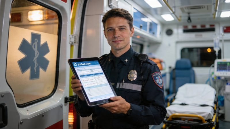
For agencies trying to standardize this, configurable digital forms help. A workflow-driven setup can require critical fields before submission and mirror the order crews work. That’s one reason many teams move these steps into structured digital processes such as custom operational workflows.
What the finished PCR should answer
Before you hit submit, the report should answer these questions:
- Who was the patient
- Why were you called
- What did you find
- What changed over time
- What did you do
- How did the patient respond
- Where did the patient end up
- Who took over care
If any one of those is missing, the chart is vulnerable.
Documentation Best Practices That Protect You and Your Patient
Most charting problems aren't caused by bad intentions. They come from shortcuts. A tired provider fills in a vague narrative, assumes the treatment is obvious, or uses language that sounds fine in the bay but falls apart under review.
That’s where strong documentation separates professionals from box-checkers.

Be objective, not interpretive
Write what you saw, heard, assessed, and did. Don’t write conclusions you can’t support.
“Patient appears intoxicated” is weak unless you explain what led you there. “Patient has slurred speech, unsteady gait, odor of alcohol on breath, and delayed responses” is objective. The second version gives the next reader something concrete.
The same applies to scene descriptions. “Unsafe scene” is too vague by itself. If law enforcement was requested, if family members were aggressive, or if access was blocked, say that plainly.
Use quotes when the patient’s words matter
Direct patient statements are valuable in high-risk situations. They help preserve meaning and reduce arguments about interpretation.
Use quotes sparingly and only when they matter. A refusal, a denial of symptoms, a complaint description, or a mental status statement often qualifies.
Examples:
- “I do not want to go to the hospital.”
- “My chest started hurting after dinner.”
- “I only want to be checked, not transported.”
That language can become important later if the patient’s account changes.
Paint the patient’s condition, not just the diagnosis
The best reports create a clear mental picture. They don't rely on canned phrases.
Instead of writing “patient stable,” write what stability looked like. Was the patient alert? Speaking in full sentences? Skin warm and dry? Ambulatory? Resting comfortably? Those specifics tell the actual story.
If another medic can’t visualize the patient from your chart, the report is still incomplete.
Refusals need extra discipline
Refusal charts are where agencies get hurt. They’re also where individual providers get exposed.
A refusal report should show that you assessed the patient, explained risks, offered transport or further evaluation as appropriate, and documented the patient’s decision-making status. It should also show what alternatives or return precautions were discussed.
Don’t settle for “patient refused.” That phrase is a liability magnet. Document the patient’s condition, what was recommended, what the patient said, and who witnessed the interaction.
Document language barriers and communication method
This area gets ignored far too often. That’s a problem for both equity and liability.
The CDC notes in its EMS disparities overview that disparities in EMS care are often overlooked in documentation, including less accurate stroke identification in women and minorities and lower pain assessment for Hispanic and Asian patients. Most PCR guidance still doesn’t include meaningful equity tracking fields.
That matters on scene. If communication is limited, your report should state:
- What barrier existed: Limited English proficiency, hearing difficulty, cognitive limitation, family interference, or another issue.
- How you communicated: Interpreter, bilingual staff member, translation tool, family relay, or simple yes/no questioning.
- How that affected care: Delayed history, limited consent discussion, uncertainty about medications, or need for repeated explanation.
Those notes don’t just protect the chart. They expose operational gaps your agency can fix.
Secure documentation matters too
Patient care reports hold sensitive health information, and crews need to treat access and storage with the same seriousness as the clinical content itself. If your agency is evaluating a digital system, review how it handles security, access control, and protected data before rolling it out. That starts with a clear understanding of the platform’s privacy practices.
A short checklist that actually works
Before closing a chart, confirm these points:
- Match the timeline: Times, narrative order, and handoff should agree.
- Show reassessment: Especially after interventions or movement.
- Name the communication barrier: If one existed, don't bury it.
- Support the refusal: Document capacity, recommendation, risks discussed, and the patient’s choice.
- Avoid opinion language: Replace labels with observations.
Good documentation doesn’t slow a service down. Rework, denials, and legal cleanup do.
Common PCR Errors That Cost Time, Money, and Credibility
Most costly PCR mistakes are boring. Missing timestamps. Contradictory details. Weak narratives. Blank required fields. None of them feel dramatic when the chart is submitted. They become dramatic when billing kicks a claim back, QA opens a review, or a receiving facility calls asking what happened.
That cost compounds because patient care report data feeds larger quality systems. According to the American Hospital Association’s hospital fast facts page, projected 2026 U.S. hospital data includes 33.5 million annual admissions, and CMS quality reporting now spans over 150 metrics. When PCR data is incomplete or inaccurate, it doesn’t just affect one call. It can affect reporting, reimbursement, and how partner facilities evaluate performance.
Problem and fix at a glance
| Error | Financial/Legal Consequence | Cost-Saving Fix |
|---|---|---|
| Missing timestamps | Weakens timeline, invites billing and legal questions | Enter time fields during the call, not after return to service |
| Vague chief complaint | Makes medical necessity harder to defend | Use the patient’s own words when possible |
| Incomplete narrative | Triggers QA callbacks and claim delays | Follow one narrative structure every time |
| Contradictory chart fields | Damages credibility of the entire report | Review for consistency before submission |
| Missing reassessment | Leaves treatment effectiveness unsupported | Document condition before and after intervention |
| Unclear refusal note | Increases liability exposure | Record capacity, risks explained, patient statements, and witnesses |
| Unapproved acronyms | Confuses reviewers outside your service | Use plain language or accepted clinical abbreviations only |
| Ignoring communication barriers | Hides care limitations and equity issues | Document interpreter use or other communication method |
Error one, the report tells two different stories
The fastest way to undermine a chart is internal contradiction. The checkbox says “no respiratory distress,” but the narrative says the patient was short of breath. The disposition says refusal, but the narrative describes transport. Once a reviewer finds one inconsistency, they stop trusting the rest.
The fix is simple but not glamorous. Do a final read with one question in mind: does every field support the same story?
Error two, vague wording that means nothing outside your station
Crews often use phrases that make sense locally but don’t travel well. “Patient sick,” “acting weird,” or “no issues en route” won’t help the hospital, billing office, or court.
Replace vague shorthand with observable facts. If transport was uneventful, say the patient remained in the same condition, tolerated transport, and was reassessed. If behavior was unusual, describe the behavior.
Error three, documenting treatment but not medical necessity
A list of interventions doesn’t explain why care was required. Reviewers need to see the complaint, findings, and treatment tied together.
For example, if you document oxygen administration, include the symptoms or findings that led to it. If you document spinal precautions, explain the mechanism or assessment findings. Don’t make the reviewer infer the reason.
The easiest PCR to defend is the one that never asks the reader to connect dots you could have connected yourself.
Error four, weak narratives that force rework
When narratives are too short, supervisors chase crews. Billing asks follow-up questions. Providers get interrupted days later and try to rebuild a call from memory.
A better process is to standardize the minimum narrative content. Not a word count. A content standard. Every chart should show complaint, relevant history, assessment, treatment, transport course, and disposition. That cuts down the expensive back-and-forth.
Error five, refusal charts with almost no defense built in
This one deserves repeating because it creates real exposure. A bare refusal line won’t hold up if the outcome turns bad.
The money-saving fix is not complicated. Build a refusal template and require completion of the decision-making assessment, recommendation given, risks discussed, communication method used, signatures, and witness details where applicable. That reduces callbacks and strengthens the legal record at the same time.
Streamline Your Patient Care Reports with Resgrid
Most agencies don’t have a documentation knowledge problem. They have a workflow problem.
Crews know what should go into patient care reports. The trouble starts when dispatch data lives in one system, charting lives in another, timestamps get copied by hand, and supervisors audit records only after the damage is done. That setup burns time and invites preventable errors.
A practical fix is to move charting closer to the operational system crews already use. A platform approach is helpful here.

What actually saves money
The biggest savings rarely come from flashy features. They come from removing duplicate entry, reducing rework, and making audits easier.
When dispatch details flow directly into the report, crews don’t have to retype addresses, units, or event details. That cuts transcription mistakes and shaves work off every call. When the form itself enforces required fields, supervisors spend less time returning charts for fixes. When reports are stored in one auditable system, agencies spend less labor digging through records for QA, compliance, or legal requests.
Those aren’t abstract benefits. They reduce labor waste and claim friction.
A practical call flow
Take a common call: dispatch sends a unit for a fall with injury.
The efficient workflow looks like this:
- Dispatch creates the event. Unit, location, and incident details already exist in the system.
- Crew responds. Core event information follows the call record forward.
- On scene, the provider opens the report form. Basic incident details are already populated.
- The form prompts structured history and assessment. Instead of relying on memory, the crew is guided through required documentation.
- Transport and handoff are recorded in the same environment. Fewer side notes, fewer copied timestamps.
- Supervisors review a complete record. They aren’t rebuilding the event from scattered tools.
That’s the difference between a charting process and a charting scramble.
Where one tool fits
Used this way, Resgrid apps give agencies a way to keep dispatch, forms, reporting, and team operations connected. For an EMS or multi-response organization, that matters because the people writing the chart are often the same people moving between dispatch notifications, location awareness, staffing, and follow-up tasks.
A cost-conscious agency should look for a few things in any platform:
- Custom forms: Can you require fields that match your protocols and local billing needs?
- Dispatch linkage: Do incident details move into the report without manual copy-paste?
- Central storage: Can leadership retrieve records quickly for QA, complaints, and audits?
- Self-service administration: Can the agency change forms and workflows without expensive implementation cycles?
Those are the levers that save money over time.
What works better than paper and disconnected software
Paper can still feel fast on scene. It stops feeling fast when someone has to decipher handwriting, re-enter details, chase signatures, and file copies. Disconnected software has a different problem. It looks digital, but crews still enter the same facts in multiple places.
A connected setup works better because it mirrors actual operations. Dispatch starts the record. The crew adds care details. Leadership reviews one trail.
If your team also manages response routing across events, facilities, or service areas, it helps to understand how mapping tools fit into the broader workflow. This roundup of best mapping software is useful because response planning and documentation quality often rise or fall together. Bad location handling early in the call creates charting mistakes later.
A realistic implementation approach
The wrong way to roll out digital PCRs is to hand crews a giant form and hope discipline solves everything. It won’t.
A better rollout usually looks like this:
- Start with the highest-friction charts: Refusals, falls, non-transport evaluations, and high-acuity calls.
- Build required fields around actual QA failures: If your agency keeps seeing missing reassessments or weak medical necessity wording, enforce those fields first.
- Use short review cycles: Supervisors should review early charts quickly and adjust form design while crews are still learning.
- Keep the narrative section alive: Structured fields help, but a clean chronological narrative still matters.
Trade-offs you should be honest about
Structured forms can improve consistency, but they can also tempt crews to over-rely on checkboxes. That’s a real trade-off. A form should support thinking, not replace it.
Another trade-off is build discipline. If you create too many required fields, crews start clicking through with low-quality entries just to submit the report. If you create too few, charts come back incomplete. The sweet spot is a form that forces the essentials and leaves room for clinical judgment.
Good software doesn’t write a defensible report for your crews. It makes it harder for them to miss what matters.
That’s the right expectation. Use the system to remove duplication, enforce completeness, and simplify review. Then train crews to write clear narratives and objective assessments inside that system.
Frequently Asked Questions About Patient Care Reports
How should I document a patient refusal or non-transport
Treat refusal charts as high-risk documentation every time. Record the assessment you completed, the recommendation you made, the risks discussed, the patient’s apparent decision-making ability, and the exact disposition.
Include the patient’s own words when the refusal is clear and relevant. If family, law enforcement, or facility staff were present, note who was involved. If you gave return precautions or advised follow-up, put that in the chart too.
A weak refusal note says the patient refused. A defensible one shows the patient was informed and that your crew didn’t walk away without justification.
What should I do when there’s a language barrier
Document the barrier and the communication method. That means noting whether the patient had limited English proficiency, whether an interpreter or bilingual staff member assisted, and whether family members were relaying information.
According to JAMA Network Open coverage of language barriers in emergency care, EMS providers often lack specific protocols for documenting communication barriers, and failing to document interpreter use or communication method can compromise care equity.
A practical chart note should answer three questions:
- What was the barrier
- How did you communicate
- Did the barrier limit history, consent, or discharge understanding
That protects the patient and gives your agency a way to identify recurring service gaps.
How detailed should the narrative be
Detailed enough that another clinician can follow the call without guessing. That doesn’t mean long for the sake of being long.
If the complaint, relevant history, assessment findings, treatment, reassessment, transport course, and disposition are all clear, the report is usually long enough. If the chart leaves open basic questions, it isn’t.
How should agencies handle storage and access
Use a system with controlled access, auditability, and clear retention practices that match your local requirements. Patient care reports contain protected health information, so operational convenience can’t come at the expense of access control.
At the agency level, limit chart access to staff who need it, review permissions regularly, and avoid side storage in personal devices, email threads, or unofficial shared folders.
Are checkboxes enough if the form is well designed
No. Checkboxes help with consistency, but they don’t replace a narrative.
The form can confirm that vitals were taken or a refusal box was selected. It usually can’t explain what the patient looked like, why your treatment decision made sense, or how the scene affected care. You still need a narrative that tells the story in plain language.
If your agency wants fewer chart corrections, cleaner audits, and a tighter link between dispatch and documentation, Resgrid, LLC offers a practical way to centralize forms, reporting, and operational records without adding another disconnected system.