
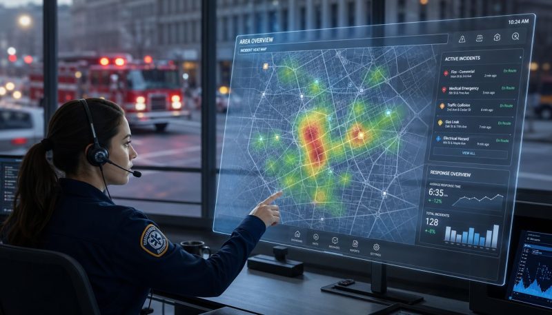
Reporting and Analytics for Emergency Response Teams
You're probably dealing with this right now. A neighborhood keeps calling about slow response times. Crews swear they're getting out the door fast. Dispatch says traffic is the problem. City leadership wants an explanation, and all anyone has are scattered incident notes, radio memories, and a few screenshots from last month.
That's how agencies stay stuck in reactive mode.
The problem usually isn't a lack of data. It's the gap between seeing information and knowing what to do with it. In emergency response, that gap costs time, money, and sometimes lives. A dashboard that tells you what happened last week is useful. A system that helps a supervisor move a unit before coverage fails is operationally valuable.
Good reporting and analytics close that gap. They turn incident history into staffing decisions, route data into fuel savings, and live unit status into faster deployment choices. They also give leaders something they often lack when budget season arrives: defensible evidence instead of anecdotes.
Beyond Gut Feelings in Emergency Response
A dispatch manager gets three complaints from the same side of town. Residents say crews always arrive late. The field crews push back. They point to construction, rail crossings, and a recent spike in medical calls. Command staff now has a familiar problem. Everyone has a story, but nobody has a clean answer.
That's where most departments lose time. They collect data, but they don't convert it into action fast enough to matter.
According to Luzmo's discussion of the Actionability Gap, 78% of emergency managers report that current analytics tools fail to provide actionable insights for immediate resource deployment during active crises, forcing reliance on manual intuition. That number tracks with what many operations leaders already know from experience. Plenty of systems can display activity. Fewer can support a decision in the moment.
What gut feelings miss
Instinct still matters. Veteran dispatchers and chiefs notice patterns before a chart does. But gut feel breaks down in three places:
- Budget conversations: Finance staff won't fund a station move or added unit because “we've been busy lately.”
- Shift accountability: A supervisor can't fix turnout delays if the only evidence is crew-to-crew debate.
- Active incidents: During a fast-moving event, nobody has time to interpret six disconnected screens.
Practical rule: If a report doesn't change staffing, routing, maintenance, training, or prevention work, it's paperwork dressed up as intelligence.
A useful reporting and analytics process does something simpler and harder. It tells the right person what needs attention, when it needs attention, and what choice is available next. That might mean identifying a response-time problem in one district, spotting repeated false alarms at one property, or seeing coverage holes before the next call drops.
What action looks like in the field
A strong operations team doesn't ask for more charts. It asks better questions.
| Operational question | Weak answer | Useful answer |
|---|---|---|
| Why are calls in this zone running long? | “It feels busier there.” | “Travel time spikes during specific hours. Reposition coverage before the peak.” |
| Why are crews tied up so often? | “We've had a rough month.” | “One class of low-value repeat incidents is consuming capacity. Address the source.” |
| Why are overtime costs climbing? | “We're short-staffed.” | “Routing, scene duration, and repeat dispatches are driving avoidable hours.” |
That's the difference between data storage and operational command. One describes the past. The other helps a team act before the next problem compounds.
Reporting vs Analytics The Rearview Mirror and The GPS
Reporting and analytics get lumped together, but they do different jobs. If you treat them as the same thing, you'll build a system that documents problems without helping anyone solve them.

Reporting shows where you've been
Reporting is the rearview mirror. It tells you what already happened.
A report can show how many incidents came in last month, which units responded most often, where turnout time slipped, or how long crews stayed committed on scene. That's valuable because emergency services need a clean record. Chiefs use it for budget justification, supervisors use it for performance review, and planners use it for trend review.
Reporting works best when you need consistency and accountability. It should answer questions like:
- Volume: How many incidents did we handle?
- Timing: When did call load peak?
- Performance: Where did response or turnout lag?
- Workload: Which units or stations carried the heaviest demand?
That's the rearview mirror doing its job. It helps you understand the route you already drove.
Analytics guides the next move
Analytics is the GPS. It uses those records, plus live conditions, to guide a decision.
If reporting tells you a district had repeated delays, analytics helps determine whether the cause is coverage, traffic, dispatch patterns, call stacking, or a station placement issue. If reporting shows one property generates frequent false alarms, analytics helps you decide whether targeted outreach, inspection follow-up, or dispatch rule changes will reduce unnecessary runs.
A report says Unit 4 was late six times. Analytics asks whether Unit 4 should have been the assigned unit at all.
That's the practical difference. Reporting answers “what happened.” Analytics answers “what should we do next.”
Why teams need both
Departments get into trouble when they rely too heavily on one side.
- Reporting without analytics creates binders, exports, and monthly summaries that nobody uses in the field.
- Analytics without sound reporting creates flashy conclusions built on incomplete or inconsistent records.
A healthy operation uses reporting for discipline and analytics for decisions. The report gives you a reliable history. The analysis helps dispatch, command, and administration choose the next action with less guesswork.
In emergency response, that pairing matters because timing matters. A rearview mirror keeps you informed. A GPS helps you avoid the next wrong turn.
Key Metrics That Drive Real-World Results
Emergency teams can measure almost everything. That's part of the problem. If you track too much, crews stop looking. If you track the wrong things, leadership starts chasing numbers that don't improve service.
The metrics worth watching are the ones tied to a decision. They should influence deployment, staffing, prevention, maintenance, or training. If they don't, they're clutter.

Start with speed, but don't stop there
Response time is the metric most agencies look at first, and for good reason. It affects patient care, fire growth, public trust, and complaint volume. But response time alone can hide the underlying issue. A long response can come from dispatch delay, turnout lag, routing trouble, or unit placement.
That's why response time should sit beside related operational measures.
- Response time: Use it to find where service is lagging geographically or by incident type.
- Turnout time: Use it to see whether the bottleneck is inside the station or after wheels roll.
- Time on scene: Use it to understand workload, handoff friction, and prolonged commitment.
- Unit availability: Use it to see whether your system has enough coverage left when calls stack up.
The so-what behind each metric
A number matters only when it changes behavior.
| Metric | What it tells you | Action that saves money or time |
|---|---|---|
| Response time | Where coverage is slow | Reposition a unit or adjust posting before adding costly permanent resources |
| Turnout time | Whether delays start before travel | Target station workflow, alerting, or shift discipline instead of blaming traffic |
| Time on scene | Which incident types tie up crews longest | Improve transfer processes, documentation, or support resource dispatch |
| Unit availability | How often coverage gets thin | Reduce unnecessary dispatches and avoid overtime caused by avoidable backfill |
One of the strongest reasons to tighten these metrics is the growing volume of usable incident data. The National Emergency Response Information System announcement states that NERIS has collected over 15 million incident reports, creating a large operational dataset for resource allocation and risk reduction. That matters at the local level because it reinforces a broader shift. Emergency services aren't working from isolated anecdotes anymore. They're working from records that can reveal repeat patterns, demand clusters, and preventable waste.
What not to chase
Some dashboards look busy but don't help command staff make better calls. Avoid metrics that sound impressive but have no operational owner.
Field note: If no supervisor is responsible for improving a metric, remove it from the main dashboard.
Common examples include broad activity counts with no district breakdown, trend lines with no threshold for intervention, and summary charts that arrive too late to influence staffing. A cleaner set of core indicators beats a crowded screen every time.
The most effective reporting and analytics setups stay close to daily operations. They focus on where delay starts, what keeps units tied up, and which recurring events drain resources without improving outcomes.
Designing Dashboards That Demand Action
Most dashboards fail for a simple reason. They're built to display data, not to direct a decision.
A screen filled with charts may look impressive in a command office, but if a dispatcher or duty chief can't glance at it and know what needs attention first, it's a data graveyard.

Lead with the question that matters now
A useful dashboard starts with the operational question of the current role.
For a dispatcher, that question may be “Which units are available and what's the fastest assignment?” For a battalion chief, it may be “Where is coverage thinning?” For administration, it may be “Which repeat incident patterns are driving preventable cost?”
That means each dashboard should have a primary decision focus. Not five. One.
A solid action dashboard usually includes:
- Current status first: Unit readiness, active incidents, and emerging gaps should be visible before historical summaries.
- Thresholds, not decoration: Red, yellow, and green status indicators work when each color triggers a known response.
- Location context: Map-based awareness matters more than abstract totals, especially when supervisors need to redirect units quickly.
If your team relies on location intelligence, mapping tools for emergency operations help connect incident patterns to actual street-level deployment choices.
Remove vanity metrics
A bad dashboard often includes numbers nobody can act on. Total calls this year. Average monthly chart packs. Long lists of incident categories without urgency ranking. These items might belong in a report package, but they don't belong on a live operations screen.
What works is ruthless prioritization.
A dashboard that gets used
Keep the screen built around exceptions. Show what's outside normal range. Show what's overdue. Show which area is exposed if one more call hits.
The best dashboards don't impress visitors. They shorten the time between noticing a problem and assigning someone to fix it.
A strong layout also respects screen pressure. Crews and dispatchers don't need tiny widgets. They need large status indicators, clear labels, and direct drill-down paths. If a response-time warning appears, the user should be able to tap into district, call type, assigned unit, and route context without opening three different systems.
This walkthrough is worth a few minutes if you're rethinking your visual setup:
Design for the owner, not the audience
Every dashboard element needs an owner. Someone has to know that a warning belongs to them.
If turnout is slipping, the station officer owns it. If one corridor repeatedly produces slow travel times, operations or dispatch leadership owns the routing response. If false alarms are draining capacity, prevention or administration owns follow-up with the property.
Without ownership, dashboards become wall monitors. With ownership, they become command tools.
Unlocking Historical and Real-Time Insights
Historical analysis and real-time analysis serve different moments in the same mission. One helps agencies prepare. The other helps them adapt while the incident is still unfolding.
Confusing the two leads to bad decisions. Teams either overreact to a live event without context or bury urgent problems under long-term trend reports.
Historical data builds smarter plans
Historical analysis is where leaders find patterns they can budget and plan around. You review months of incident records to identify demand clusters, repeated false alarm addresses, seasonal risk changes, and districts that routinely lose coverage during certain hours.
That kind of review supports decisions such as station workload balancing, training focus, community risk reduction, and call-handling policy changes. It also helps answer a tough leadership question: are we dealing with an isolated complaint, or a repeatable operational pattern?
A multi-car pileup is a good example. After the scene clears, historical review can show where dispatch sequencing worked, where staging became congested, and whether mutual aid timing supported or slowed the operation. That review improves the next major roadway response.
Real-time insight changes the current incident
Real-time analytics matter when conditions are moving faster than a written report ever could. During an active event, dispatch and command need live unit location, status changes, route conditions, and escalation signals to keep the response organized.
That's where AVL unit tracking for live operations becomes practical, not decorative. Location and status data support immediate decisions about reassignment, nearest-unit selection, and gap coverage when multiple incidents start competing for the same resources.
Real-time systems are also getting more advanced. This overview of predictive analytics in emergency preparedness notes that predictive systems can integrate deep learning with live sensor data such as temperature and smoke levels, along with video feeds, to anticipate emergencies and improve response speed and accuracy before conditions become critical.
Use each mode at the right time
| Situation | Historical insight | Real-time insight |
|---|---|---|
| Repeated delays in one district | Confirms whether the issue is persistent | Shows whether a current unit move can protect coverage now |
| Large roadway incident | Reveals after-action lessons | Helps manage staging, routing, and reassignment during the event |
| Facility risk monitoring | Shows recurring hazard patterns | Flags live escalation from sensors or video feeds |
Video can be especially useful during escalations, but only if teams manage it responsibly. For agencies relying on camera feeds or remote scene visibility, guidance on optimizing live video bandwidth usage can help reduce bottlenecks that make live visuals unreliable when they matter most.
Historical analysis improves the next response. Real-time analysis protects the current one.
The strongest reporting and analytics programs combine both. They don't just archive incidents. They learn from them, then feed that learning back into the next dispatch decision.
Putting Analytics to Work with Resgrid
The value of analytics shows up when it changes the day-to-day workload. That means fewer wasted responses, less administrative drag, cleaner routing, and better use of the units you already have.
One practical way to apply that is through Resgrid's feature set for dispatch and coordination, where reporting, unit tracking, messaging, and incident records can be used together instead of scattered across separate tools.

Cut administrative waste first
Savings often start in the least glamorous place: documentation.
According to Resgrid's discussion of CAD dispatch software, automated call logging in CAD systems saves emergency centers hundreds of administrative hours annually. That matters because every hour spent re-entering call details is an hour not spent on supervision, quality review, or active coordination.
The cost advantage compounds when the logged data becomes searchable and reviewable. If a property or area is generating frequent false alarms, analytics can expose the pattern. Once that happens, agencies can work with property owners or local authorities to reduce repeat activations. That cuts unnecessary responses, which in turn lowers fuel use and vehicle wear.
Use reports to target avoidable runs
A practical workflow looks like this:
- Capture call details automatically: Let the CAD record timestamps, call types, locations, and disposition data as the incident unfolds.
- Review repeat locations monthly: Look for addresses, sites, or facility types that recur without producing meaningful intervention.
- Assign follow-up ownership: Prevention, code enforcement, facilities staff, or local partners should handle the repeat-cause problem.
- Track whether repeats decline: If the pattern changes, you've converted reporting into direct savings.
That's what effective reporting and analytics should do. Not just document that units were busy, but show why they were busy in ways the agency can fix.
Reduce fuel, overtime, and unnecessary mileage
Routing is the next place agencies leave money on the table. When crews get sent along inefficient paths, or when traffic and closures aren't reflected in dispatch decisions, the result is predictable: longer travel, more overtime pressure, and more wear on apparatus.
GIS mapping and smart routing can help supervisors and dispatchers choose better assignments based on current conditions rather than habit. In practice, that means avoiding known chokepoints, reducing avoidable mileage, and seeing when one side of a district is carrying too much of the response burden.
Operational habit: Review one week of dispatches for avoidable repeat routes. If crews keep hitting the same traffic obstacle, fix the assignment logic before asking for more staffing.
The agencies that save money with these tools usually do one thing right. They connect reporting to a named operational change. A route gets updated. A false alarm property gets addressed. A coverage plan gets adjusted. Without that step, the software becomes a filing cabinet.
From Reactive to Proactive Your Data-Driven Future
The shift isn't really from paper to software. It's from reacting to the pager to preparing for the next call before it lands.
That's what good reporting and analytics deliver in emergency response. They replace loose assumptions with visible patterns. They help dispatchers see where coverage is slipping, help supervisors correct recurring delays, and help agency leaders explain spending with evidence instead of instinct. The result is better service and tighter control over costs that creep in through wasted runs, poor routing, repeated alarms, and unowned delays.
The agencies that improve fastest usually don't start with a giant data project. They start small and stay disciplined. Track one metric that matters. Review one recurring problem address. Build one dashboard that tells one supervisor what action belongs to them today.
Start where the waste is obvious. Repeated false alarms, long turnout times, and recurring travel delays are easier to fix than abstract performance goals.
Data won't replace judgment. It gives judgment something firmer to stand on. In this line of work, that's enough to change how a department deploys, how it spends, and how well it protects the people who count on it.
If your team wants a practical way to connect dispatch, tracking, messaging, and reporting in one place, Resgrid, LLC is worth evaluating. It gives first responders and emergency operations teams a way to turn incident records and live operational data into decisions that improve coverage, reduce waste, and keep crews coordinated without adding unnecessary complexity.